合舍新作 | Picnic画廊 一张折纸引发的想象
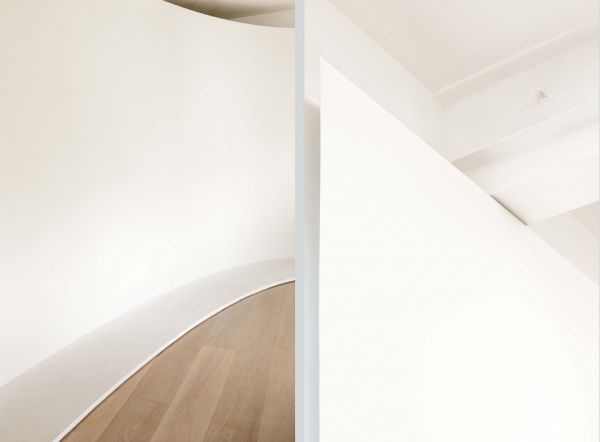
画廊布局一般都由白色墙体组成。合舍从折纸技术中汲取了设计的灵感—-将白色墙体想象为一张白纸,并运用了两种基本的折纸技术来唤起光与影所带来的氛围差异:折痕折叠和弯曲折叠。运用这种白色墙体与白纸的类比,我们把墙壁的边缘以锐角细化,形成与周围窗户和墙壁强烈的明暗反差。
Most galleries consist of plain white walls. HeShe’s design approach is to draw inspiration from paper folding techniques, and interpret the white wall as a piece of paper. The two fundamental folding techniques which evoke two very different moods of light and shadows are crease folding and curve folding. Using the analogy of crease folding in building walls, the edges of the walls are detailed with acute angle, creating pronounced shadows in contrast with the adjacent windows and walls.
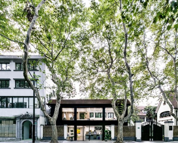
▼画廊外立面,street facade ?黎不妞
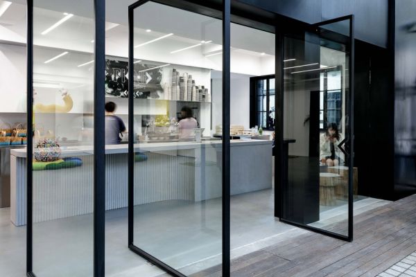
▼入口,entrance ?黎不妞
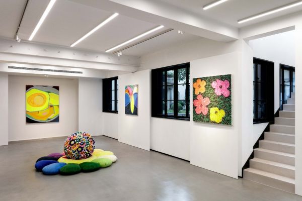
▼一楼展示区,ground floor exhibition area ?黎不妞
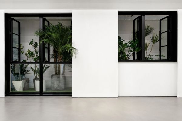
▼后方小街场景,view to the small back alley ?黎不妞
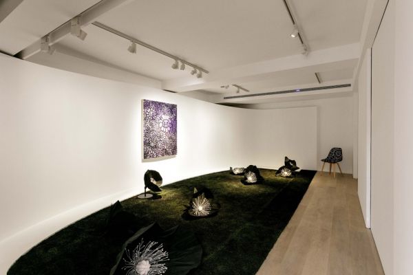
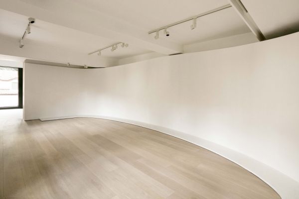
在主展区,向内凹的墙壁朝展览空间呈现弯曲,带着曲线的墙面产生出的柔和的光影,为观展者带来更加平和的展出氛围。原有窗户前设计一些能移动白色墙体。 美术馆长能按照主题与艺术展览品来控制天然灯光或者人工照明。空间灯光控制有灵活性, 也增加光与影的层次感。
For the second floor main exhibition area, the concave wall is curved towards the room. This analogy of wall as curved paper creates softer shadows, and consequently a calmer atmosphere for the viewers. In addition, we designed white sliding walls in front of existing windows. This gives the curator the flexibility to combine either natural light or artificial light with their art installation, and consequently creating different mood of shadows on the curved wall.
▼二楼主要展示区,带有人工照明,main exhibition area on the second floor with artificial light ?黎不妞
▼二楼主要展示区,带有自然光,main exhibition area on the second floor with natural light ?黎不妞
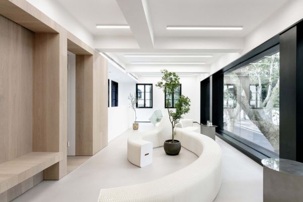
由于画廊的功能介于传统严谨的画廊和可供休憩的咖啡馆之间, 我们怀揣“玩耍”的态度挑选出家具,安排了座位布局与陈列品的摆放。家具挑算也是按照我们的概念想法,带有纸张,折叠和弯曲的构思。
Given that the project lies somewhere in between a quiet composed gallery and a causal cafe, it gives us the freedom to be a bit playful with furniture selection, temporary seating arrangement and display items placement. When looking for furniture for the multipurpose area, we tried to find chairs and tables that follows the idea of paper, folding and bending.
▼楼梯,staircase ?黎不妞
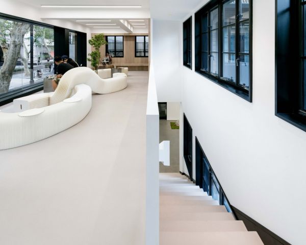
▼多功能区域,multipurpose area ?黎不妞
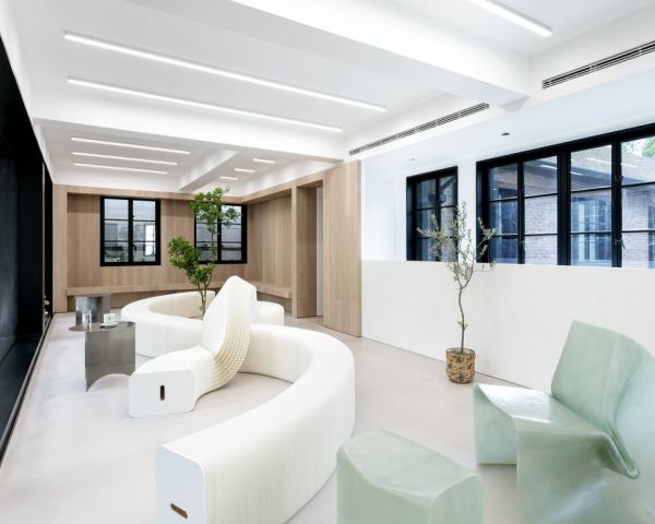
▼从室内望向街道,view to street level ?黎不妞
▼墙体细节,wall detail ?黎不妞
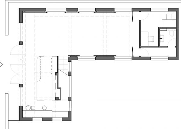
▼一层平面图,ground floor plan ?HeShe
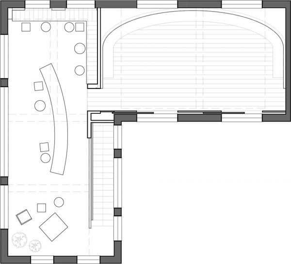
▼二层平面图,second floor plan ?HeShe
项目名称:Picnic Gallery
项目位置:上海,中国
设计公司:合舍 HeShe
项目面值: 170平方米
灯光顾问: ERCO Lighting
地板材料: Imondi flooring
家具品牌: Mario Tsai Studio, Mountain Living
植物顾问: Moodever Studio
平面设计顾问: Yao Min
施工团队:张镜
业主: Raya Zhou
摄影师: 黎不妞
相关家居装修设计
合舍新作 | Picnic画廊 一张折纸引发的想象
在客厅走廊挂画时,这些配画指南最实用!
anish kapoor在里森画廊里的硅树脂鲜肉作品
画家刘国柱:画廊要培养消费者艺术品位
曾建龙携手【GALLERY画廊】 打造空间美学原创的生活方式
折纸立体大房子 房子的风格有哪些
母婴之家联合丽婴房发起纸尿裤5折狂欢节
橙舍美术馆 你的艺术生活之选
“歪果仁”纸巾画爆红,神作萌萌哒魔性十足
印刷手提袋纸张的种类

